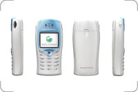
 I got a Sony Ericsson T68i phone earlier this week. It's cool. It's missing some of the Nokia touch, but it's ages better than both the Nokia 7110 I had in Denmark some four years ago and the crappy Nextel and Sprint phones I've had the last years are not in the same league at all. I still use my old Nokia 6110 I had with ATT as an alarm clock.
So the good things I've found so far:
- It's really light.
- It's small. Completely disappears in any pocket.
- So light and small that it has that Japanese style plastic toy feeling.
- The e-mail to SMS gateway seems to work fine (I'm using T-Mobile)
- Sending SMS'es to Danish phones (and back) works to my surprise.
- T-Mobile supports CSD so I can use it as a modem using my minutes instead of using GPRS to $1 per megabyte
- Add to the wireless modem unlimited minutes in the weekend and it's pretty neat.
- Adding a background image is Too Neat. And I never even understood the changing face plates thing.
- It comes with a handsfree thing.
- The blue light that flashes when bluetooth is activated is Really Sexy. As sexy as little blue lights come anyway.
- The blue keyboard backlight is neat too.
- The screen is *bright*.
There are also
bad things of course
- iSync does not support IrDA. I'll have to pick up a bluetooth adapter next time I go by the local Apple store.
- The buttons are tiny and cheap plastic like. I'm sorta getting used to it, but it's not great. They could not be much bigger, but they could be better.
- The speaker isn't super loud. Usually loud enough, but why can't it be louder?
- Vibrator Alert is weak. I'm not sure I will feel it in an outer pocket in my jacket.
- No external speaker (which is only redeeming quality - or quality at all - with Nextel/Motorola phones). Would have been great for listening to voice mails and navigating the oh-so-popular-with-too-many-companies touch tone navigation systems.
- It's cool with a color screen and all, but 256 colors? I haven't thought about the "web palette" since '97!
- With the backilght turned off the screen is completely unreadable.
- It's Slow. Not unusable, but seriously, why does the interface have to be so sluggish?
Geez!
Original entry with images and comments and stuff....
 I got a Sony Ericsson T68i phone earlier this week. It's cool. It's missing some of the Nokia touch, but it's ages better than both the Nokia 7110 I had in Denmark some four years ago and the crappy Nextel and Sprint phones I've had the last years are not in the same league at all. I still use my old Nokia 6110 I had with ATT as an alarm clock.